Ryan PennColorado real estate
Internal design referencev1.0 · September 2026

Ryan Penn + Solterra

A refined foothills
design language.

The single source of truth for web, direct mail, property reports, social graphics, presentations, and neighborhood marketing.
LocalEditorialWarmPrecise
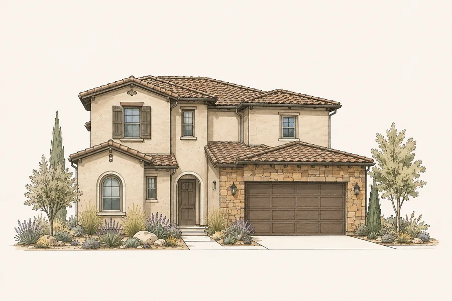
Tuscan Arch Solterra home illustration
01

North star

Design principles

Every piece should feel rooted in place, quietly premium, and immediately useful.

01

Local before luxurious

Lead with genuine Solterra and foothills knowledge. Luxury comes through restraint, accuracy, and care.

02

Editorial, not promotional

Use confident headlines, generous space, and real information. Avoid loud sales language and decorative clutter.

03

Personal, not performative

Ryan appears as a steady local advisor. The work should feel one-to-one even when produced at scale.

04

Specific beats generic

Name the builder, model, street, market activity, or homeowner question. Precision earns attention.

02

Foundation

Color system

Warm paper, evergreen confidence, navy editorial authority, and a measured touch of Colorado terracotta.

Warm IvoryPrimary canvas
Foothills GreenBrand, actions, trust
Ink NavyEditorial headlines
TerracottaWarm accent only
SandstoneCards and dividers
SageLandscape support
CharcoalBody copy
Paper WhiteRaised surfaces
60% ivory
20% green
14% navy
6% rust
03

Voice made visible

Typography

Source Serif 4 carries the neighborhood story. DM Sans keeps facts, navigation, and actions clear.

Display · Source Serif 4

Local knowledge.
Beautifully expressed.

Display 72/0.96H1 56/1.02H2 40/1.08H3 26/1.16
Body · DM Sans

Clear, useful, human.

Use sentence case for headlines and body copy. Keep paragraphs short, favor concrete language, and make every call to action describe the value on the other side.

SOLTERRA HOMEOWNER UPDATE

Body 17/1.65Label 13/1.2Eyebrow 12/1.2 + 0.22em
04

Signature asset

Solterra editorial homes

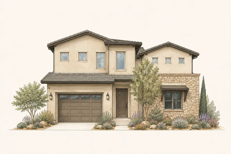
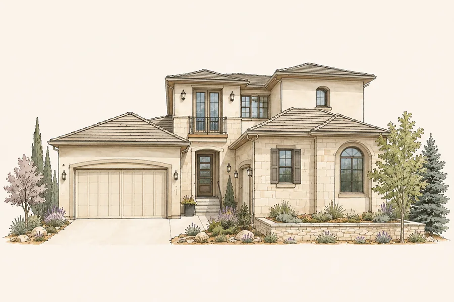
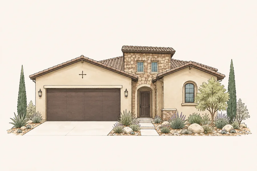
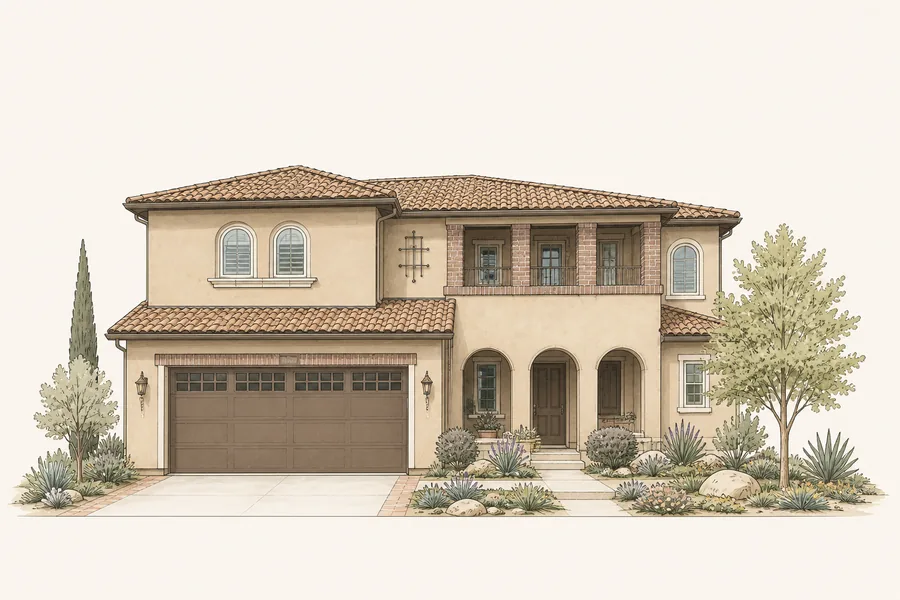
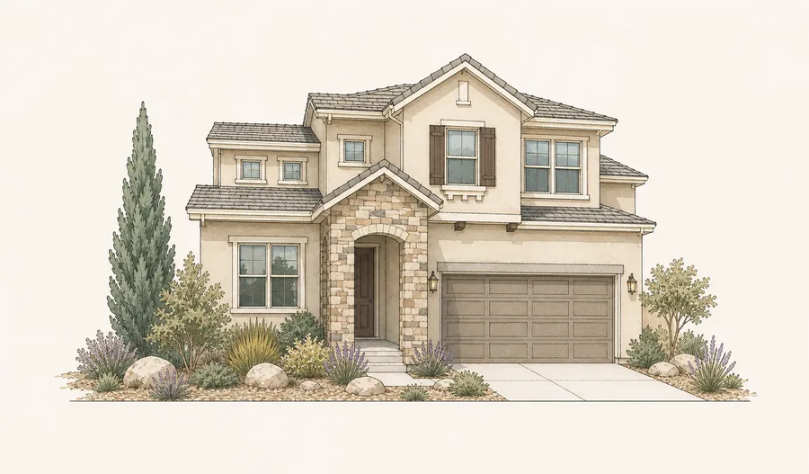
Fine-line architectural illustration with restrained watercolor fills on warm ivory. Recognizably Solterra—never a generic subdivision.

Call this style

Architectural watercolor-and-ink editorial illustration

Front elevation, natural perspective, warm mineral palette, pale paper ground, delicate pen detail, xeric Colorado landscaping, and no hard photographic shadows.
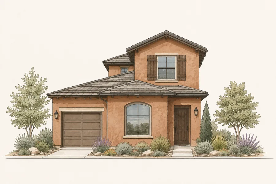
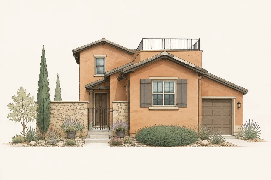
Terracotta Courtyard Solterra home illustration
01
Terracotta CourtyardSolterra editorial home
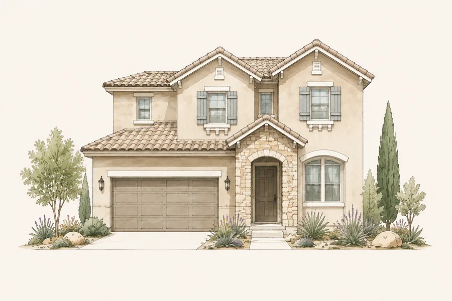
Stone Gable Solterra home illustration
02
Stone GableSolterra editorial home
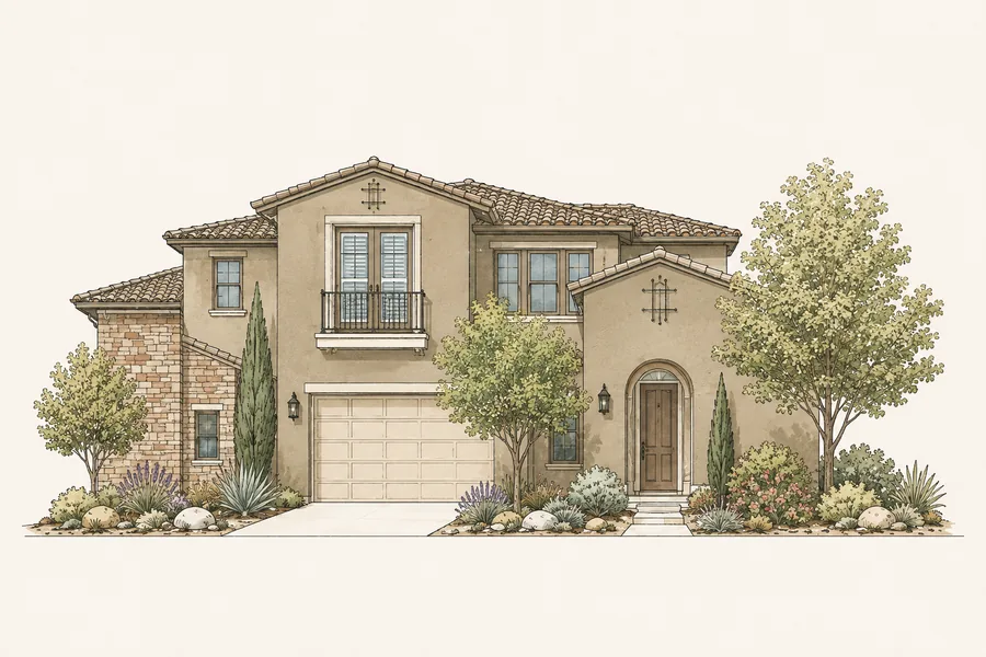
Tuscan Arch Solterra home illustration
03
Tuscan ArchSolterra editorial home
Stone Wing Solterra home illustration
04
Stone WingSolterra editorial home
Pale Stone Villa Solterra home illustration
05
Pale Stone VillaSolterra editorial home
Tower Ranch Solterra home illustration
06
Tower RanchSolterra editorial home
Arched Loggia Solterra home illustration
07
Arched LoggiaSolterra editorial home
Twin Gable Solterra home illustration
08
Twin GableSolterra editorial home
Terracotta Terrace Solterra home illustration
09
Terracotta TerraceSolterra editorial home
Tuscan Balcony Solterra home illustration
10
Tuscan BalconySolterra editorial home
Full illustration contact sheetAll ten approved home styles
05

Digital language

Core components

Simple parts designed to feel composed, calm, and recognizable across pages and campaigns.

Buttons

Information card

For Solterra homeowners

See how your home compares.

Recent comparable sales, current competition, and a property-specific value range.

Request your private report →

Editorial feature

Colorado living

Designed around the foothills.

Pair a generous image field with a short, grounded story. Let the home, landscape, or neighborhood detail carry the emotion.

Spacing rhythm

4
8
12
16
24
32
48
64
96
06

Direct mail system

Postcard campaign

The approved 9×6 builder-and-model campaign establishes the print expression of the brand.
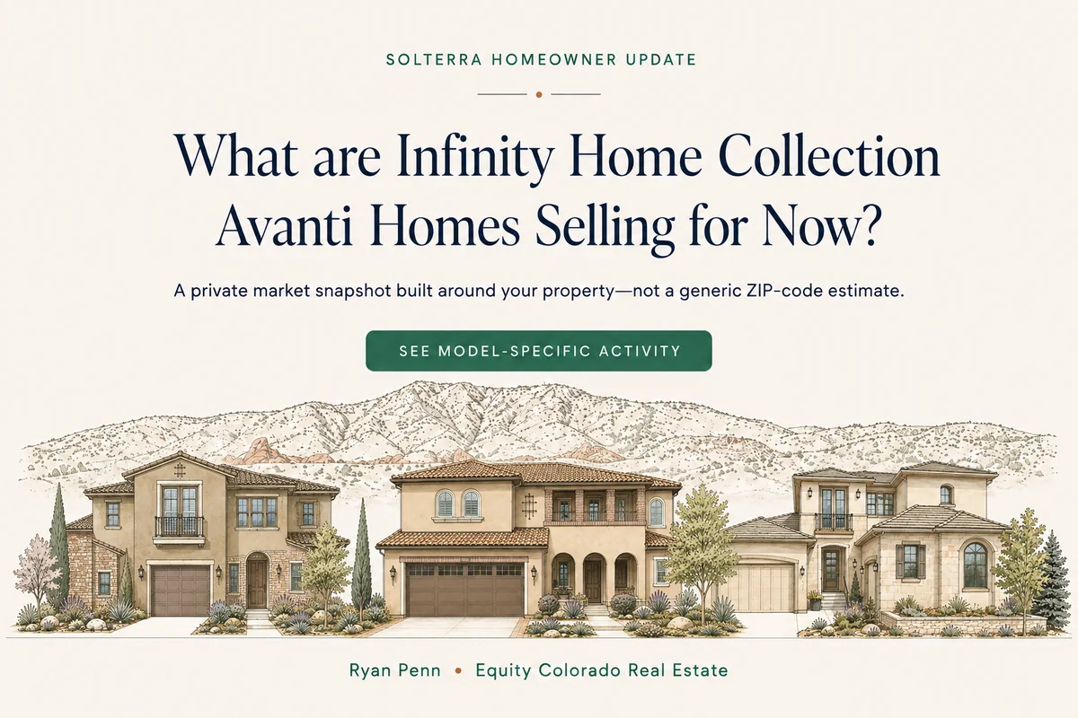
Builder and model activity postcard front
Front · Attention + relevanceDownload WebP
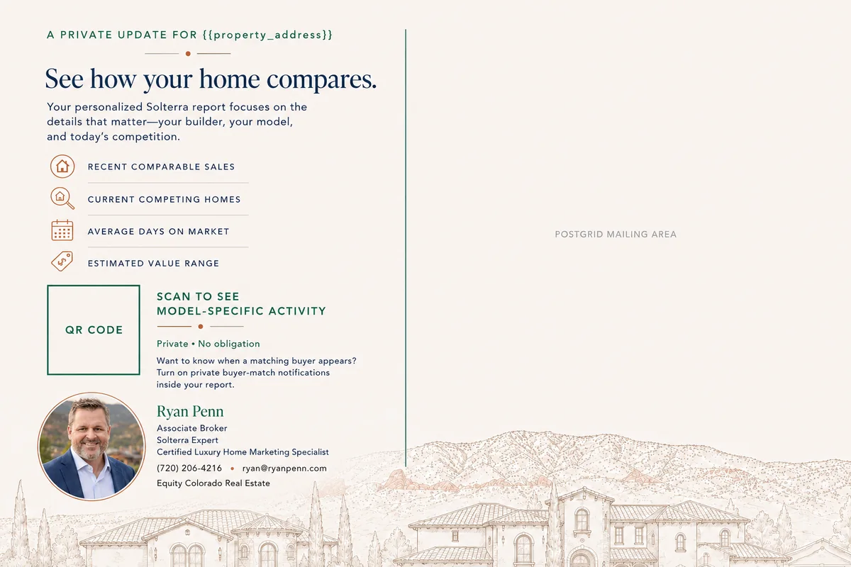
Builder and model activity postcard back
Back · Value + responseDownload WebP
01

Name the homeowner’s world

Builder + model makes the message feel researched, not mass-produced.

02

Promise useful specificity

Comparable sales, competing inventory, days on market, and estimated range.

03

Use one clear action

A property-specific QR destination—not a generic homepage.

04

Make trust visible

Local expertise, calm presentation, credentials, and direct contact information.

07

Verbal identity

Voice and messaging

Ryan’s voice is direct, neighborly, informed, and never pushy.

Lead with the homeowner question

“What are Infinity Home Collection Avanti homes selling for now?”

Questions create curiosity without making an unsupported promise.

Make the value concrete

“See model-specific activity.”

Prefer a useful outcome over vague actions such as “Learn more.”

Reduce pressure

“Private · No obligation.”

Let expertise and relevance do the persuading.

Use“See how your home compares.”Specific, useful, homeowner-centered.
Avoid“Your home could be worth millions!”Hype erodes the quiet authority of the brand.
08

Guardrails

Keep it recognizably Ryan Penn

Use these checks before approving a website, mailer, report, social post, or presentation.

Do

  • Use real Solterra architecture and foothills context.
  • Give headlines room to breathe.
  • Keep actions singular, useful, and specific.
  • Balance local warmth with market precision.
  • Use terracotta as punctuation, not wallpaper.
  • Write like an experienced advisor speaking to one person.

Don’t

  • Use generic skyline, key, handshake, or stock-house imagery.
  • Fill every space or add decoration without meaning.
  • Stack multiple competing calls to action.
  • Rely on luxury clichés, hype, or artificial urgency.
  • Introduce unrelated blues, bright golds, or neon accents.
  • Flatten Solterra into generic “Denver real estate.”

The standard

Local clarity, beautifully delivered.

Ryan Penn · Associate Broker · Solterra Expert